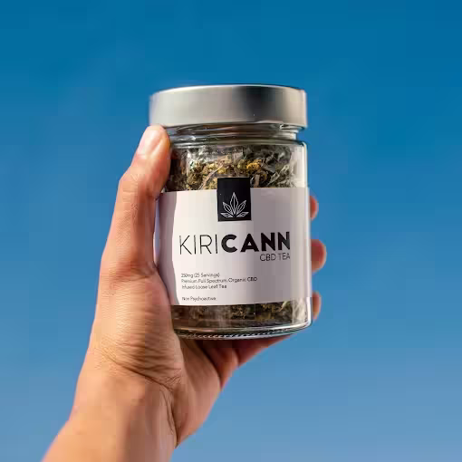
KiriCann, experts in cannabis medicinal products, approached us to transform their brand and digital presence into something that matched the calibre of their offerings. With deep expertise and a commitment to education and quality, they required a corporate identity and e-commerce platform that would position them as a global leader in the medicinal cannabis space.
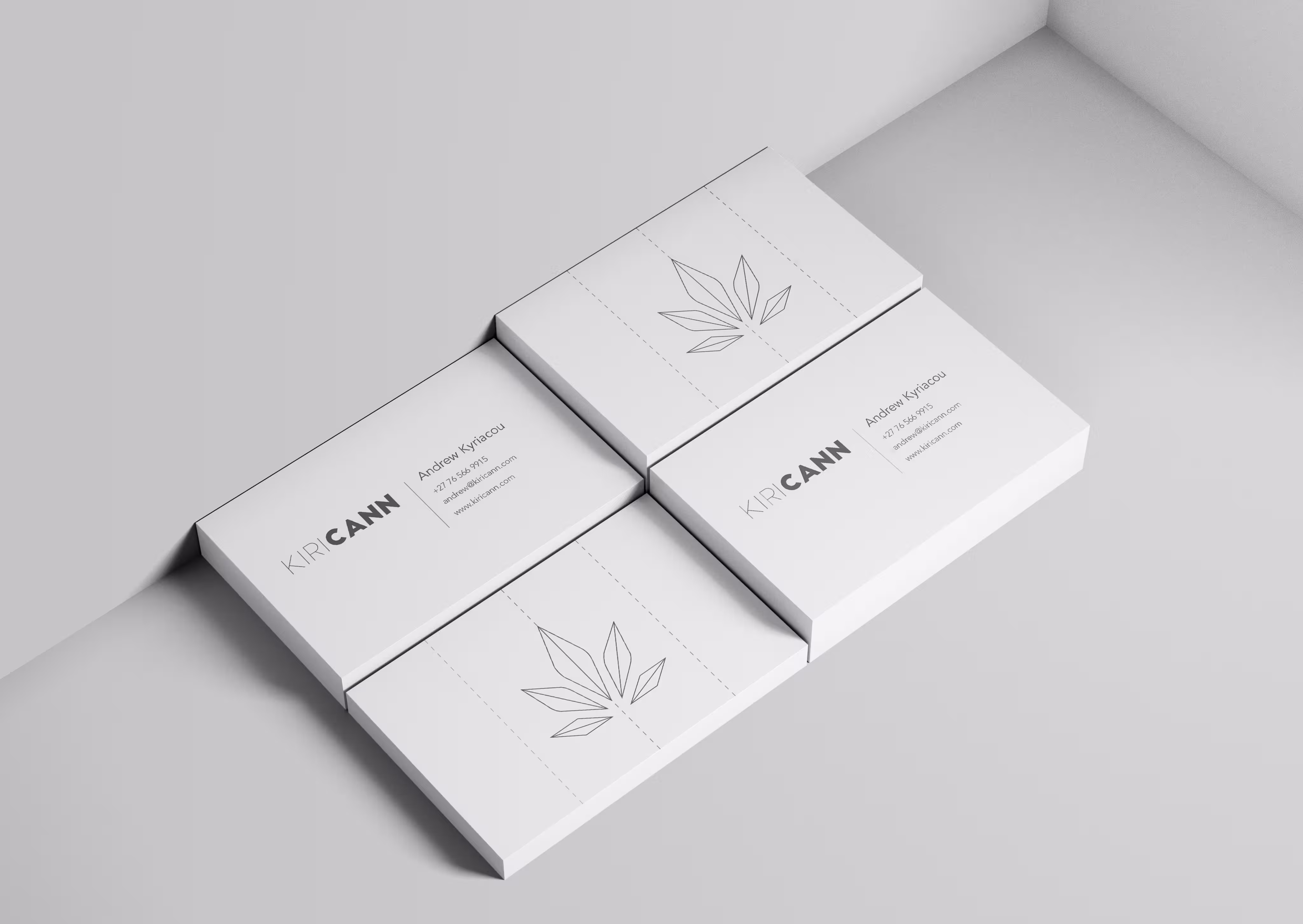
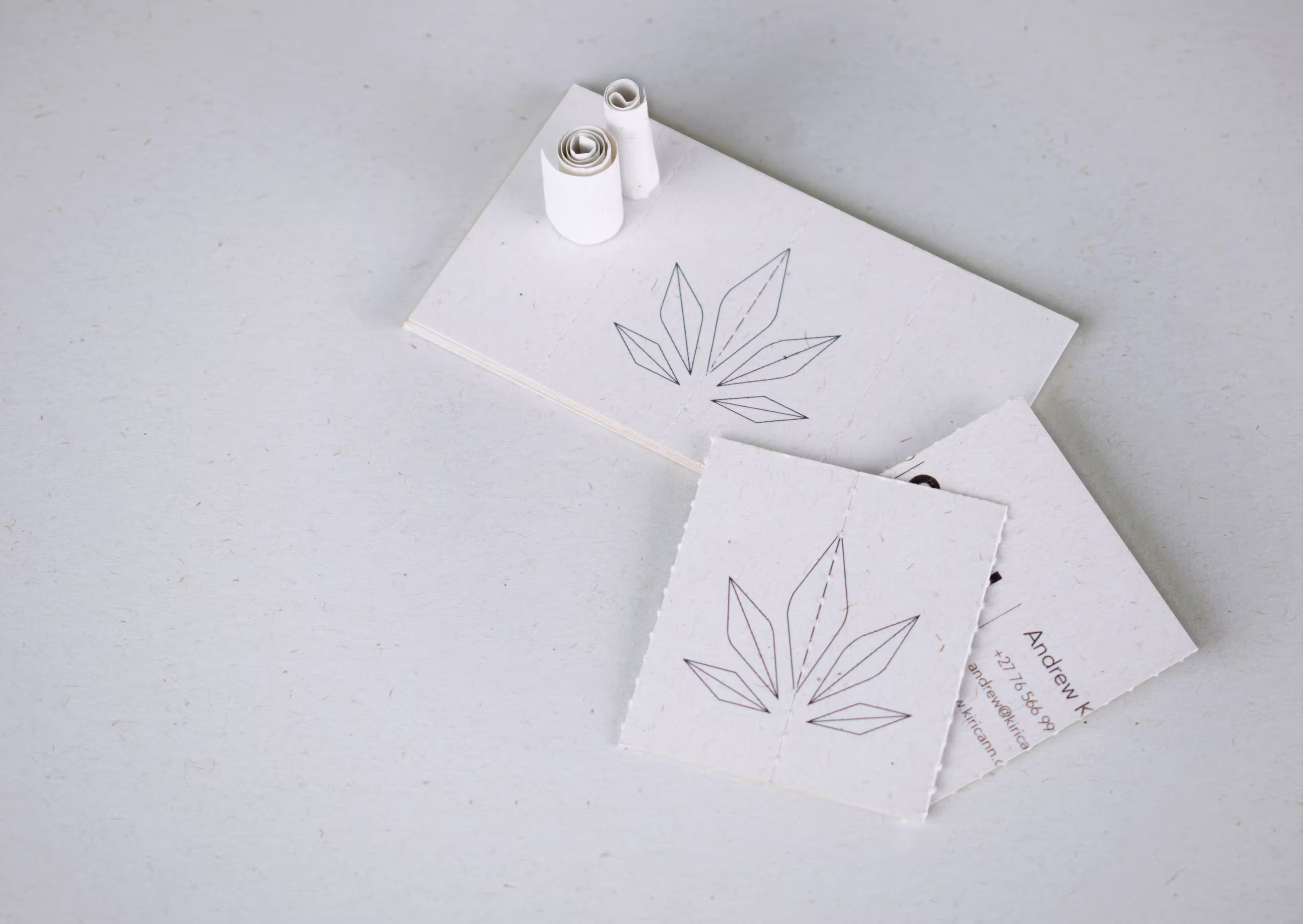
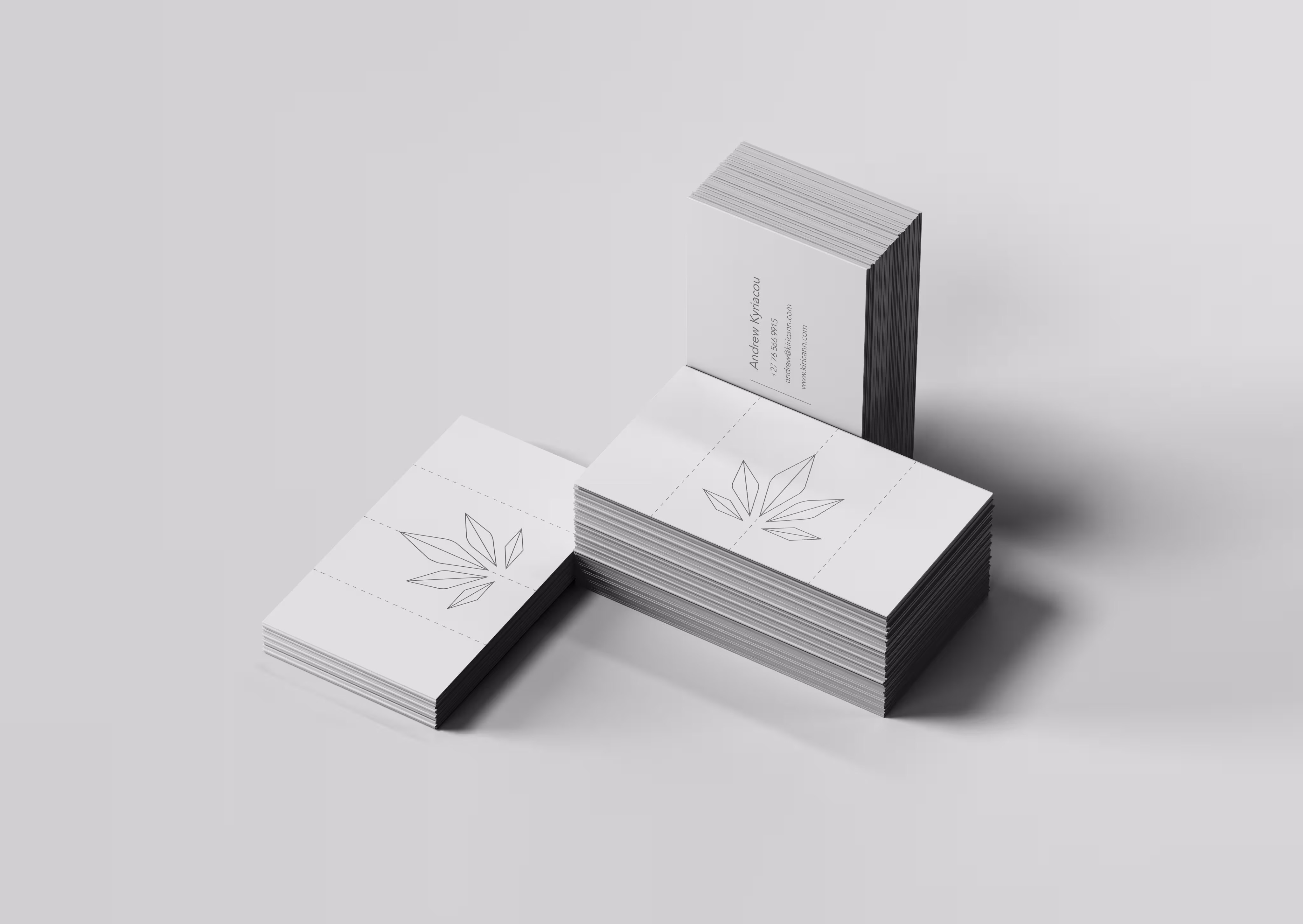
The result was a refined, modern brand system and an international e-commerce experience -crowned by a 2021 Loeries Award for Creative Use of Paper for their business card design.
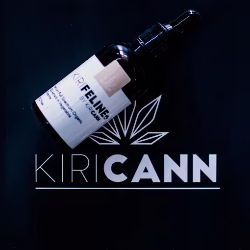
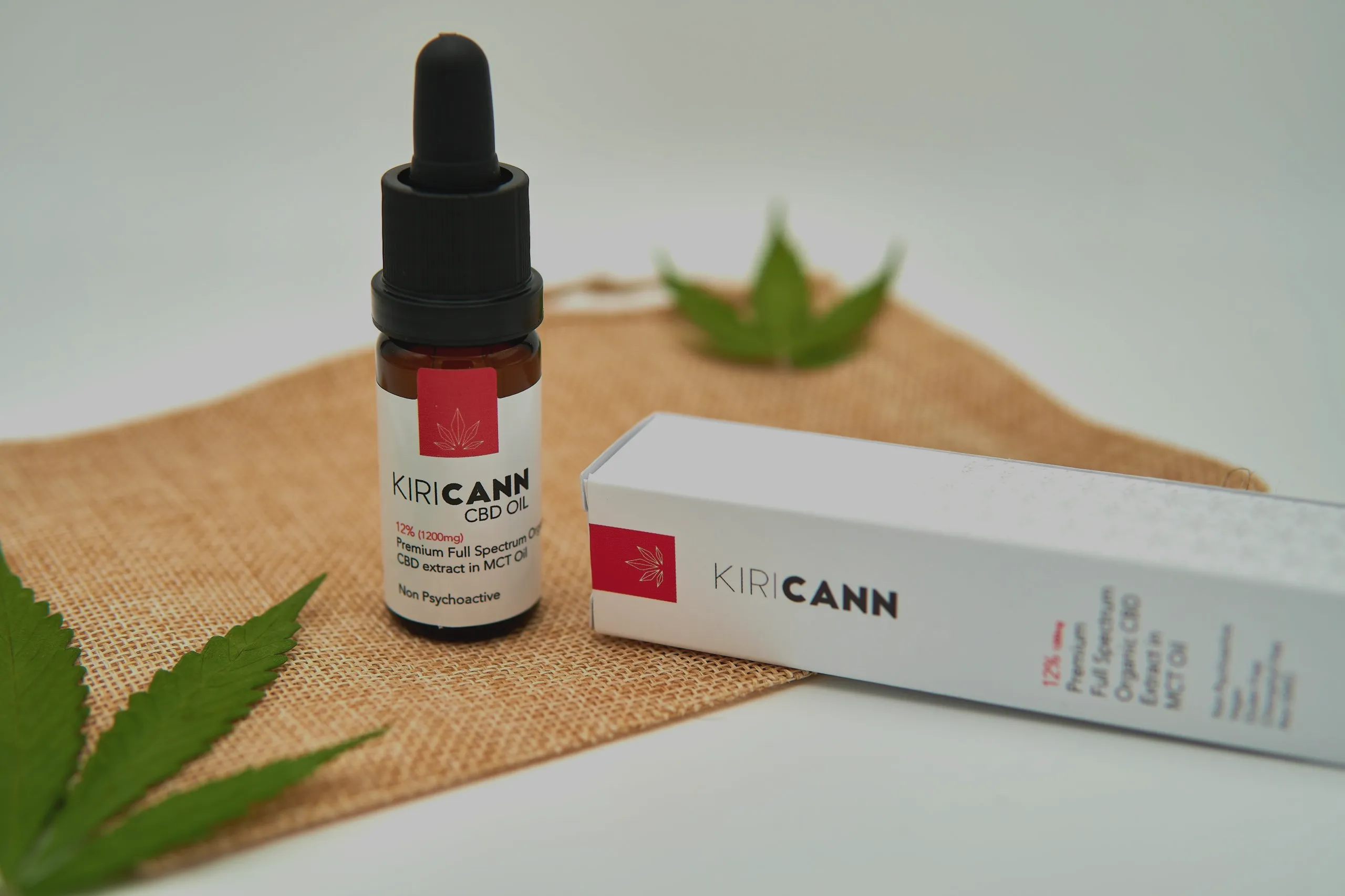
KiriCann sought a complete brand refresh. Their objective was clear: develop a modern, simplistic logo and cohesive corporate identity that would reflect their scientific credibility, natural foundations, and international ambitions.
They required:
A contemporary logo and visual identity
Cohesive branding across all touchpoints
An international
e-commerce website
Strong exhibition branding for Cannabis Expo 2019
Strong exhibition branding for Cannabis Expo 2019
They didn’t just want a rebrand - they wanted to elevate their entire market presence.
The cannabis industry sits at the intersection of wellness, science, and regulation. KiriCann needed to appear credible and clinical, while still honouring the natural origins of their products.
We began with a comprehensive discovery phase to understand KiriCann’s mission, history, and long-term ambitions.
KiriCann’s transformation positioned them as a refined, world-class medicinal cannabis brand.
Their new identity reflects both their heritage and their forward-thinking approach to cannabis education and innovation.
KiriCann allowed us to explore the delicate balance between nature and science — between botanical authenticity and clinical precision.
It was a project rooted in purpose, education, and innovation. Winning a Loeries Award for the creative execution made it even more special, but the real reward was seeing a brand step confidently into its global potential.